Menu photos and layout: what actually makes guests order more
Not every dish needs a photo, and more decoration isn't the goal. Here's what layout and imagery genuinely change about what guests order — and what to skip.
By Menju
A photo doesn't make a dish taste better, but it changes what a guest expects — and expectation is most of what decides an order. The dish a guest can picture is the dish they're more willing to risk trying; the one described only in text defaults to whatever sounds safest. That's the entire case for investing in menu imagery, and it's also why doing it badly (blurry photos, inconsistent framing, a photo on every single item) can cost you more than having no photos at all.
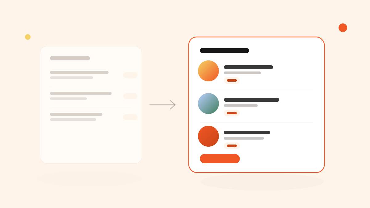
Photos work best on the dishes guests hesitate on
Not every dish needs one. A photo earns its place next to something unfamiliar, seasonal, or higher-priced than the surrounding items — the dishes where a guest's imagination is doing the selling, badly, without help. A classic everyone already knows doesn't need convincing. Spending your best photography there is wasted effort; spending it on the dish nobody's ordering because they can't picture it is where the return actually is.
A tight, consistent circular crop reads cleaner on a menu than a full rectangular photo competing with the text around it — it keeps the eye moving down the list instead of stalling on one image.
Layout decides what gets read first
Before anyone reads a word, they scan the shape of the page. Three layout choices do most of the work:
- How each dish is arranged. Name and price on one line reads fast and works well for straightforward lunch menus. Stacking the description underneath gives more room to sell an unfamiliar dish. Neither is universally right — it depends on how much explaining a given menu actually needs.
- What's grouped together. Sections should match how a guest thinks ("Lunch", "Weekend brunch"), not how the kitchen organizes prep. A guest scrolling past sections that don't apply to them is a guest who's already half-decided to order the first familiar thing they see.
- Where the price sits. A clearly aligned price column reads as confident and easy to scan. Prices buried mid-sentence read as something to search for, which is friction you didn't intend to add.
Consistency matters more than polish
A menu with five gorgeous photos and twelve dishes with none looks less trustworthy than one with twelve plain, well-lit photos of consistent size and crop. Inconsistency reads as unfinished, even when every individual photo is good. If you can't shoot every dish properly, it's usually better to pick a smaller, complete set — a "chef's picks" row, say — than to photograph a random third of the menu.
What this looks like in Menju
Menju's design editor updates a live preview as you change things, so none of this is guesswork — you set the dish layout (inline, name + price, or stacked), upload images for the background, header, or a decorative frame, and see exactly what a guest will see before you save. If you'd rather start from something built already, the built-in templates apply a full layout, color, and image setup in one click, which is a reasonable starting point even if you plan to adjust it afterward. The full breakdown is in designing your menu.
Next steps
Once the layout is right, the menu itself needs to actually reach guests — see adding your menu to your website for that part. And if allergen information is part of what you're redesigning, allergen labeling for restaurants covers how to do it without cluttering the layout you just fixed.